My portfolio · eLearning example
Engaging Sales Training
ApproachTeaching a sales insights tool the week it landed
More examples
iHeartMedia needed to teach its sales staff a new sales insights tool, Autoflyte. The tool was built for selling to auto dealerships, so instead of a menu list I made the course navigation a car dashboard.
Each section sits beside a round icon taken from a car — a key for the introduction, a speedometer for why to use Autoflyte, a steering wheel for how. Finished sections carry a white check mark, the section the learner is up to is green and open, and everything still ahead sits in red. There is no separate progress bar because the dashboard is one.
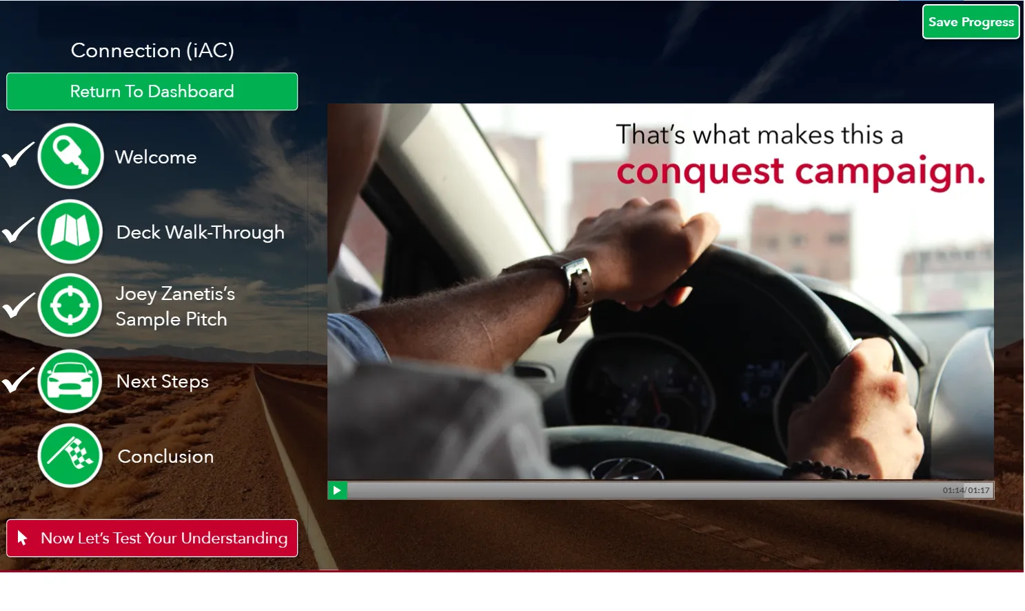
Opening a section keeps the pattern at a smaller scale. The learner drops into its own step list — welcome, deck walk-through, a colleague’s sample pitch, next steps, conclusion — with the same check marks filling in across the explainer videos and knowledge checks. A Return To Dashboard button sits above the list, and a red button at the bottom hands them to the quiz.
The whole course runs close to 40 minutes, longer than a seller is likely to sit through in one stretch. So a Save Progress button stays fixed in the top right corner of every screen, and learners can stop wherever they are and come back to that spot.
- Tools
- Articulate Storyline · Custom navigation · Explainer videos · Software demo